ShopDreamUp AI ArtDreamUp
Deviation Actions


Suggested Deviants


Suggested Collections


![Muuri [ Free to Use ]](https://images-wixmp-ed30a86b8c4ca887773594c2.wixmp.com/i/2e1f434b-225f-4f32-9579-f83ee3a5e66d/d5yaxkj-12097607-b709-4466-8c71-1376f5c7f650.png/v1/crop/w_184,h_184,x_0,y_7,scl_0.48806366047745/muuri___free_to_use___by_baseadopts_d5yaxkj-92s-2x.png)
![Muuri [ Free to Use ]](https://images-wixmp-ed30a86b8c4ca887773594c2.wixmp.com/i/2e1f434b-225f-4f32-9579-f83ee3a5e66d/d5yaxkj-12097607-b709-4466-8c71-1376f5c7f650.png/v1/crop/w_92,h_92,x_0,y_4,scl_0.24403183023873/muuri___free_to_use___by_baseadopts_d5yaxkj-92s.png)
![Adopt Species - Wysps Reference Sheet[OLD] - 04](https://images-wixmp-ed30a86b8c4ca887773594c2.wixmp.com/f/d0b7dc0b-4af4-4b5a-a310-29911ada08c1/d92aiv8-c8a92296-99c3-4323-9a63-fd1bdb4753f6.png/v1/crop/w_184,h_184,x_0,y_70,scl_0.10285075461151,q_70,strp/adopt_species___wysps_reference_sheet_old____04_by_fuyusfox_d92aiv8-92s-2x.jpg?token=eyJ0eXAiOiJKV1QiLCJhbGciOiJIUzI1NiJ9.eyJzdWIiOiJ1cm46YXBwOjdlMGQxODg5ODIyNjQzNzNhNWYwZDQxNWVhMGQyNmUwIiwiaXNzIjoidXJuOmFwcDo3ZTBkMTg4OTgyMjY0MzczYTVmMGQ0MTVlYTBkMjZlMCIsIm9iaiI6W1t7ImhlaWdodCI6Ijw9MjU5MCIsInBhdGgiOiJcL2ZcL2QwYjdkYzBiLTRhZjQtNGI1YS1hMzEwLTI5OTExYWRhMDhjMVwvZDkyYWl2OC1jOGE5MjI5Ni05OWMzLTQzMjMtOWE2My1mZDFiZGI0NzUzZjYucG5nIiwid2lkdGgiOiI8PTEwMjQifV1dLCJhdWQiOlsidXJuOnNlcnZpY2U6aW1hZ2Uub3BlcmF0aW9ucyJdfQ.S0eEoYfzqV-hgLO7NpvjnDV9u3NslMNTW5e4nt5FmXo)
![Adopt Species - Wysps Reference Sheet[OLD] - 04](https://images-wixmp-ed30a86b8c4ca887773594c2.wixmp.com/f/d0b7dc0b-4af4-4b5a-a310-29911ada08c1/d92aiv8-c8a92296-99c3-4323-9a63-fd1bdb4753f6.png/v1/crop/w_92,h_92,x_0,y_35,scl_0.051425377305757,q_70,strp/adopt_species___wysps_reference_sheet_old____04_by_fuyusfox_d92aiv8-92s.jpg?token=eyJ0eXAiOiJKV1QiLCJhbGciOiJIUzI1NiJ9.eyJzdWIiOiJ1cm46YXBwOjdlMGQxODg5ODIyNjQzNzNhNWYwZDQxNWVhMGQyNmUwIiwiaXNzIjoidXJuOmFwcDo3ZTBkMTg4OTgyMjY0MzczYTVmMGQ0MTVlYTBkMjZlMCIsIm9iaiI6W1t7ImhlaWdodCI6Ijw9MjU5MCIsInBhdGgiOiJcL2ZcL2QwYjdkYzBiLTRhZjQtNGI1YS1hMzEwLTI5OTExYWRhMDhjMVwvZDkyYWl2OC1jOGE5MjI5Ni05OWMzLTQzMjMtOWE2My1mZDFiZGI0NzUzZjYucG5nIiwid2lkdGgiOiI8PTEwMjQifV1dLCJhdWQiOlsidXJuOnNlcnZpY2U6aW1hZ2Uub3BlcmF0aW9ucyJdfQ.S0eEoYfzqV-hgLO7NpvjnDV9u3NslMNTW5e4nt5FmXo)


![Thorax and Luna (Celectial Advice\Season 7) [mlp]](https://images-wixmp-ed30a86b8c4ca887773594c2.wixmp.com/f/8b8d534c-fc03-498d-81f4-012215e7f728/db61u3k-060e9bd3-1d26-4908-86ae-dfc98ac5e3f7.jpg/v1/crop/w_184,h_184,x_36,y_0,scl_0.098290598290598,q_70,strp/thorax_and_luna__celectial_advice_season_7___mlp__by_tavifly_db61u3k-92s-2x.jpg?token=eyJ0eXAiOiJKV1QiLCJhbGciOiJIUzI1NiJ9.eyJzdWIiOiJ1cm46YXBwOjdlMGQxODg5ODIyNjQzNzNhNWYwZDQxNWVhMGQyNmUwIiwiaXNzIjoidXJuOmFwcDo3ZTBkMTg4OTgyMjY0MzczYTVmMGQ0MTVlYTBkMjZlMCIsIm9iaiI6W1t7ImhlaWdodCI6Ijw9OTAwIiwicGF0aCI6IlwvZlwvOGI4ZDUzNGMtZmMwMy00OThkLTgxZjQtMDEyMjE1ZTdmNzI4XC9kYjYxdTNrLTA2MGU5YmQzLTFkMjYtNDkwOC04NmFlLWRmYzk4YWM1ZTNmNy5qcGciLCJ3aWR0aCI6Ijw9MTYwMCJ9XV0sImF1ZCI6WyJ1cm46c2VydmljZTppbWFnZS5vcGVyYXRpb25zIl19.JjKSTT-DwpkCEfgccPaxfFCenf1dUr8M4WvzSTOGjmg)
![Thorax and Luna (Celectial Advice\Season 7) [mlp]](https://images-wixmp-ed30a86b8c4ca887773594c2.wixmp.com/f/8b8d534c-fc03-498d-81f4-012215e7f728/db61u3k-060e9bd3-1d26-4908-86ae-dfc98ac5e3f7.jpg/v1/crop/w_92,h_92,x_18,y_0,scl_0.049145299145299,q_70,strp/thorax_and_luna__celectial_advice_season_7___mlp__by_tavifly_db61u3k-92s.jpg?token=eyJ0eXAiOiJKV1QiLCJhbGciOiJIUzI1NiJ9.eyJzdWIiOiJ1cm46YXBwOjdlMGQxODg5ODIyNjQzNzNhNWYwZDQxNWVhMGQyNmUwIiwiaXNzIjoidXJuOmFwcDo3ZTBkMTg4OTgyMjY0MzczYTVmMGQ0MTVlYTBkMjZlMCIsIm9iaiI6W1t7ImhlaWdodCI6Ijw9OTAwIiwicGF0aCI6IlwvZlwvOGI4ZDUzNGMtZmMwMy00OThkLTgxZjQtMDEyMjE1ZTdmNzI4XC9kYjYxdTNrLTA2MGU5YmQzLTFkMjYtNDkwOC04NmFlLWRmYzk4YWM1ZTNmNy5qcGciLCJ3aWR0aCI6Ijw9MTYwMCJ9XV0sImF1ZCI6WyJ1cm46c2VydmljZTppbWFnZS5vcGVyYXRpb25zIl19.JjKSTT-DwpkCEfgccPaxfFCenf1dUr8M4WvzSTOGjmg)


You Might Like…


![Vanlentina[AT]](https://images-wixmp-ed30a86b8c4ca887773594c2.wixmp.com/f/2748060e-3f7d-4b79-9aa8-16a907590b44/dbr2c94-755b5d4a-7f70-4340-abb6-ed8000d5b45f.png/v1/crop/w_184,h_184,x_0,y_24,scl_0.37322515212982/vanlentina_at__by_twinkepaint_dbr2c94-92s-2x.png?token=eyJ0eXAiOiJKV1QiLCJhbGciOiJIUzI1NiJ9.eyJzdWIiOiJ1cm46YXBwOjdlMGQxODg5ODIyNjQzNzNhNWYwZDQxNWVhMGQyNmUwIiwiaXNzIjoidXJuOmFwcDo3ZTBkMTg4OTgyMjY0MzczYTVmMGQ0MTVlYTBkMjZlMCIsIm9iaiI6W1t7ImhlaWdodCI6Ijw9NzUzIiwicGF0aCI6IlwvZlwvMjc0ODA2MGUtM2Y3ZC00Yjc5LTlhYTgtMTZhOTA3NTkwYjQ0XC9kYnIyYzk0LTc1NWI1ZDRhLTdmNzAtNDM0MC1hYmI2LWVkODAwMGQ1YjQ1Zi5wbmciLCJ3aWR0aCI6Ijw9NDkzIn1dXSwiYXVkIjpbInVybjpzZXJ2aWNlOmltYWdlLm9wZXJhdGlvbnMiXX0.oNstfzRbETQkh3G_IwGEBVxhPuWknZS8Eljgzr8uN10)
![Vanlentina[AT]](https://images-wixmp-ed30a86b8c4ca887773594c2.wixmp.com/f/2748060e-3f7d-4b79-9aa8-16a907590b44/dbr2c94-755b5d4a-7f70-4340-abb6-ed8000d5b45f.png/v1/crop/w_92,h_92,x_0,y_12,scl_0.18661257606491/vanlentina_at__by_twinkepaint_dbr2c94-92s.png?token=eyJ0eXAiOiJKV1QiLCJhbGciOiJIUzI1NiJ9.eyJzdWIiOiJ1cm46YXBwOjdlMGQxODg5ODIyNjQzNzNhNWYwZDQxNWVhMGQyNmUwIiwiaXNzIjoidXJuOmFwcDo3ZTBkMTg4OTgyMjY0MzczYTVmMGQ0MTVlYTBkMjZlMCIsIm9iaiI6W1t7ImhlaWdodCI6Ijw9NzUzIiwicGF0aCI6IlwvZlwvMjc0ODA2MGUtM2Y3ZC00Yjc5LTlhYTgtMTZhOTA3NTkwYjQ0XC9kYnIyYzk0LTc1NWI1ZDRhLTdmNzAtNDM0MC1hYmI2LWVkODAwMGQ1YjQ1Zi5wbmciLCJ3aWR0aCI6Ijw9NDkzIn1dXSwiYXVkIjpbInVybjpzZXJ2aWNlOmltYWdlLm9wZXJhdGlvbnMiXX0.oNstfzRbETQkh3G_IwGEBVxhPuWknZS8Eljgzr8uN10)


Featured in Groups

Description
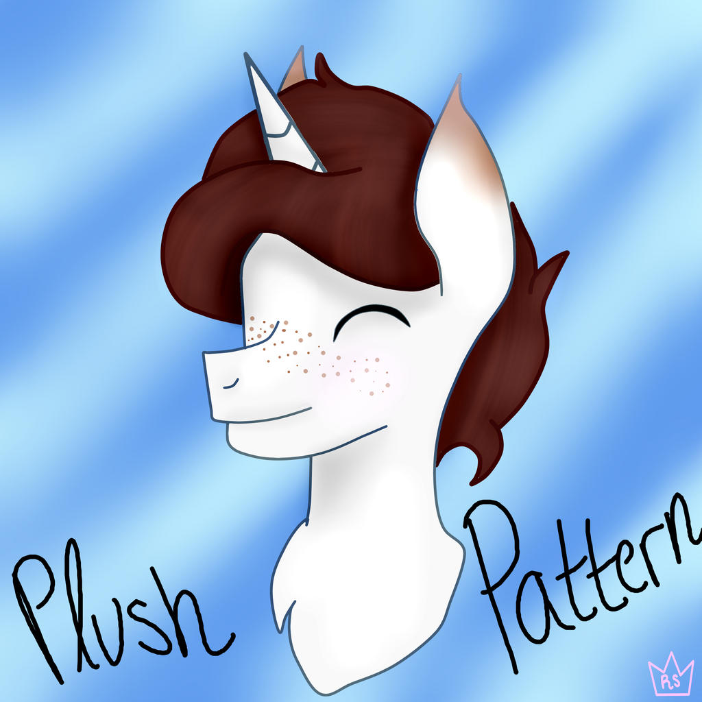
This is the first of three headshots to pay  for an adorable adopt
1st: royal-snowflake.deviantart.com…
3rd: royal-snowflake.deviantart.com…
EDIT: Commissions for headshots is open!
Check these out as well!
Contest!: royal-snowflake.deviantart.com…
Newcomers!: royal-snowflake.deviantart.com…
for an adorable adopt 1st: royal-snowflake.deviantart.com…
3rd: royal-snowflake.deviantart.com…
EDIT: Commissions for headshots is open!
Check these out as well!
Contest!: royal-snowflake.deviantart.com…
Newcomers!: royal-snowflake.deviantart.com…
Image size
3000x3000px 3.38 MB
© 2018 - 2024 Royal-Snowflake
Comments7
Join the community to add your comment. Already a deviant? Log In
Hi! I’m here from  with some constructive criticism.
Overall, I think you’ve done a good job with this piece! The line art is subtle but clean and crisp. The background also works well. While it doesn’t particularly complement any part of the character’s design, it does help give this simple headshot a cheery atmosphere!
Speaking of cheeriness, I think you did a great job conveying the character’s emotions through his(?) facial expression and posture. I do think that a little more of the shoulders should be visible, but the parts of the neck and chest you have there look great, particularly the shadow under his chin.
The rest of the shading looks most good, too, though I’d suggest making it a lot bolder next time to give your drawing more depth. The ear especially looks very flat, since you didn’t distinguish between the edge and the inside. Though additional shading might look too dark as you’re working on it, the contrast will make your art much more dynamic when it’s finished. Even if you aren’t going for realism, more contrast will give most art a more aesthetically pleasing look.
Furthermore, you can use your shading to add texture to the fur and mane. Adding highlights to the dark brown hair will give it a shinier, more appealing look.
Another thing you’ve done well is perspective, particularly in the places the hair, horn, and ears overlap each other. The only thing that looks a little off, detail-wise, is the character’s muzzle. It looks like it’s angled too far to the left, making it inconsistent with the rest of the facial features. The edge of his right eye should be visible there as well, instead of just leaving that section of his face blank.
In addition, you might want to consider typing the words instead of simply writing them out next time. It’ll give your work a cleaner look and make the text easier to read.
I hope this comment is helpful to you! Keep up the good work!
with some constructive criticism.Overall, I think you’ve done a good job with this piece! The line art is subtle but clean and crisp. The background also works well. While it doesn’t particularly complement any part of the character’s design, it does help give this simple headshot a cheery atmosphere!
Speaking of cheeriness, I think you did a great job conveying the character’s emotions through his(?) facial expression and posture. I do think that a little more of the shoulders should be visible, but the parts of the neck and chest you have there look great, particularly the shadow under his chin.
The rest of the shading looks most good, too, though I’d suggest making it a lot bolder next time to give your drawing more depth. The ear especially looks very flat, since you didn’t distinguish between the edge and the inside. Though additional shading might look too dark as you’re working on it, the contrast will make your art much more dynamic when it’s finished. Even if you aren’t going for realism, more contrast will give most art a more aesthetically pleasing look.
Furthermore, you can use your shading to add texture to the fur and mane. Adding highlights to the dark brown hair will give it a shinier, more appealing look.
Another thing you’ve done well is perspective, particularly in the places the hair, horn, and ears overlap each other. The only thing that looks a little off, detail-wise, is the character’s muzzle. It looks like it’s angled too far to the left, making it inconsistent with the rest of the facial features. The edge of his right eye should be visible there as well, instead of just leaving that section of his face blank.
In addition, you might want to consider typing the words instead of simply writing them out next time. It’ll give your work a cleaner look and make the text easier to read.
I hope this comment is helpful to you! Keep up the good work!